
Oct 8, 2026
How to Improve Website Forms Without Losing Lead Quality
Web Design
Guides
Recent
The Question
How do you make your enquiry form easier to complete without filling your inbox with leads that go nowhere?

The Approach
Ask only for what you need to reply well
A form should make it easy for the right people to get in touch. Every extra field is a small reason for someone to give up, but the right questions also help you qualify and respond properly. The goal is not the shortest form. It is the shortest form that still lets you give a useful reply.
Decide what you genuinely need
List every field and ask what you would do without it. Name and email are almost always essential. A phone number is only worth requiring if you really call people. Company size or budget can be useful for qualifying, but they feel intrusive early on. You can gather more once a conversation has started. Research from sources such as the Baymard Institute on checkout and form usability consistently points to unnecessary fields as a source of friction.
Use smart questions to protect quality
Rather than adding many fields, add one or two that do the filtering for you:
A dropdown for the service they are interested in, so you can route the enquiry
An optional message box asking "What are you hoping to achieve?"
A budget range with a "not sure yet" option, if budget is a real filter for you
A timeline question, such as "this month", "next quarter" or "just exploring"
Pair this with honest information on the page itself. Clear scope and pricing guidance reduces unsuitable enquiries before the form is ever seen. Our piece on service page copywriting explains how.
Make it clear and friendly
Use plain labels that stay visible, not placeholder text that vanishes when someone types. Make the button say what happens, such as "Request a callback" rather than "Submit". Tell people what happens next and how soon they will hear from you, and show a clear confirmation message. The Nielsen Norman Group's articles on form design are a reliable source of further detail.
Test on mobile and for accessibility
Check that fields, buttons and error messages work well on small screens, including the right keyboard for email and phone numbers. Our mobile-first checklist covers the detail. Make sure the form can be completed by keyboard and that errors are described in words, as set out in our accessibility basics.
Handle data responsibly
A form collects personal data, so tell people why you are asking and how you will use their details, and link to your privacy notice. The ICO's UK GDPR guidance is the right place to check your obligations. Do not add people to a marketing list unless you have a lawful basis, and seek professional advice if you are unsure.
Measure, then change one thing at a time
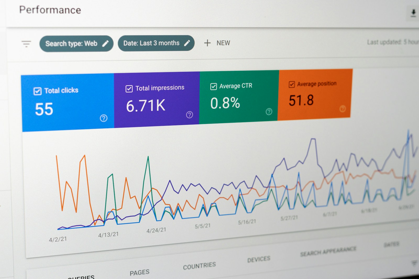
Track form views, starts, completions and the quality of leads that come through. If you change several things at once you will not know what worked. Try one change, such as removing the phone number field or rewording the button, and compare results over a few weeks. Quality matters as much as quantity, so review how many enquiries became real conversations, not just how many arrived.

The Takeaway
Change one thing at a time so you know what made the difference, and judge success by the quality of conversations, not only the number of submissions. To improve how your forms perform, talk to our web design team.

In other news
(TT® — LDN, UK)
©2026 the think


FAQ
01
What does a project look like?
02
What are your payment terms?
03
How much does a project cost?
04
How long do projects typically take?
05
How do we measure success?
06
What do we need to get started?
07
Will we be able to manage the site ourselves?
08
Why choose The Think over hiring in-house?
Oct 8, 2026
How to Improve Website Forms Without Losing Lead Quality
Web Design
Guides
Recent
The Question
How do you make your enquiry form easier to complete without filling your inbox with leads that go nowhere?
The Approach
Ask only for what you need to reply well
A form should make it easy for the right people to get in touch. Every extra field is a small reason for someone to give up, but the right questions also help you qualify and respond properly. The goal is not the shortest form. It is the shortest form that still lets you give a useful reply.
Decide what you genuinely need
List every field and ask what you would do without it. Name and email are almost always essential. A phone number is only worth requiring if you really call people. Company size or budget can be useful for qualifying, but they feel intrusive early on. You can gather more once a conversation has started. Research from sources such as the Baymard Institute on checkout and form usability consistently points to unnecessary fields as a source of friction.
Use smart questions to protect quality
Rather than adding many fields, add one or two that do the filtering for you:
A dropdown for the service they are interested in, so you can route the enquiry
An optional message box asking "What are you hoping to achieve?"
A budget range with a "not sure yet" option, if budget is a real filter for you
A timeline question, such as "this month", "next quarter" or "just exploring"
Pair this with honest information on the page itself. Clear scope and pricing guidance reduces unsuitable enquiries before the form is ever seen. Our piece on service page copywriting explains how.
Make it clear and friendly
Use plain labels that stay visible, not placeholder text that vanishes when someone types. Make the button say what happens, such as "Request a callback" rather than "Submit". Tell people what happens next and how soon they will hear from you, and show a clear confirmation message. The Nielsen Norman Group's articles on form design are a reliable source of further detail.
Test on mobile and for accessibility
Check that fields, buttons and error messages work well on small screens, including the right keyboard for email and phone numbers. Our mobile-first checklist covers the detail. Make sure the form can be completed by keyboard and that errors are described in words, as set out in our accessibility basics.
Handle data responsibly
A form collects personal data, so tell people why you are asking and how you will use their details, and link to your privacy notice. The ICO's UK GDPR guidance is the right place to check your obligations. Do not add people to a marketing list unless you have a lawful basis, and seek professional advice if you are unsure.
Measure, then change one thing at a time
Track form views, starts, completions and the quality of leads that come through. If you change several things at once you will not know what worked. Try one change, such as removing the phone number field or rewording the button, and compare results over a few weeks. Quality matters as much as quantity, so review how many enquiries became real conversations, not just how many arrived.
The Takeaway
Change one thing at a time so you know what made the difference, and judge success by the quality of conversations, not only the number of submissions. To improve how your forms perform, talk to our web design team.
In other news
(TT® — LDN, UK)
©2026 the think
FAQ
01
What does a project look like?
02
What are your payment terms?
03
How much does a project cost?
04
How long do projects typically take?
05
How do we measure success?
06
What do we need to get started?
07
Will we be able to manage the site ourselves?
08
Why choose The Think over hiring in-house?
Oct 8, 2026
How to Improve Website Forms Without Losing Lead Quality
Web Design
Guides
Recent
The Question
How do you make your enquiry form easier to complete without filling your inbox with leads that go nowhere?
The Approach
Ask only for what you need to reply well
A form should make it easy for the right people to get in touch. Every extra field is a small reason for someone to give up, but the right questions also help you qualify and respond properly. The goal is not the shortest form. It is the shortest form that still lets you give a useful reply.
Decide what you genuinely need
List every field and ask what you would do without it. Name and email are almost always essential. A phone number is only worth requiring if you really call people. Company size or budget can be useful for qualifying, but they feel intrusive early on. You can gather more once a conversation has started. Research from sources such as the Baymard Institute on checkout and form usability consistently points to unnecessary fields as a source of friction.
Use smart questions to protect quality
Rather than adding many fields, add one or two that do the filtering for you:
A dropdown for the service they are interested in, so you can route the enquiry
An optional message box asking "What are you hoping to achieve?"
A budget range with a "not sure yet" option, if budget is a real filter for you
A timeline question, such as "this month", "next quarter" or "just exploring"
Pair this with honest information on the page itself. Clear scope and pricing guidance reduces unsuitable enquiries before the form is ever seen. Our piece on service page copywriting explains how.
Make it clear and friendly
Use plain labels that stay visible, not placeholder text that vanishes when someone types. Make the button say what happens, such as "Request a callback" rather than "Submit". Tell people what happens next and how soon they will hear from you, and show a clear confirmation message. The Nielsen Norman Group's articles on form design are a reliable source of further detail.
Test on mobile and for accessibility
Check that fields, buttons and error messages work well on small screens, including the right keyboard for email and phone numbers. Our mobile-first checklist covers the detail. Make sure the form can be completed by keyboard and that errors are described in words, as set out in our accessibility basics.
Handle data responsibly
A form collects personal data, so tell people why you are asking and how you will use their details, and link to your privacy notice. The ICO's UK GDPR guidance is the right place to check your obligations. Do not add people to a marketing list unless you have a lawful basis, and seek professional advice if you are unsure.
Measure, then change one thing at a time
Track form views, starts, completions and the quality of leads that come through. If you change several things at once you will not know what worked. Try one change, such as removing the phone number field or rewording the button, and compare results over a few weeks. Quality matters as much as quantity, so review how many enquiries became real conversations, not just how many arrived.
The Takeaway
Change one thing at a time so you know what made the difference, and judge success by the quality of conversations, not only the number of submissions. To improve how your forms perform, talk to our web design team.
FAQ
What does a project look like?
What are your payment terms?
How much does a project cost?
How long do projects typically take?
How do we measure success?
What do we need to get started?
Will we be able to manage the site ourselves?
Why choose The Think over hiring in-house?